Musings on color management, CHROMiX products and services and other relevant topics.

Showing posts with label colorgeeking. Show all posts

Thursday, January 20, 2022

Color Management conference is ON!

The Color Management Conference put on by Printing United Alliance is full speed ahead this year. This annual (until last year) conference is going to be at La Jolla just North of San Diego - a welcome location in January after a wild winter in North America.

I am happy to be presenting a new session at the conference. Following up on the fun we had last time we met (below) - this year my session is on the Secrets of Color Management
January 22 - 25th, 2022


Friday, January 7, 2022

Color changing car

Welcome to a brand new year - new color technology!

BMW unveiled a color-changing car which uses E-ink, similar to how the Kindle reader screen works. This does not emit light, but reflects light and allows items like ebooks (and this car's color) to be visible in broad daylight. The demo car is limited to a black and white palette, but they claim that the technology can be expanded to include colors. The idea is that you can change the color of your car according to your mood.  

I wonder if you can program it to be "black" to absorb heat when it's cold outside - and white in the summer?

Thursday, April 29, 2021

Color Ready 2021

Printing United Alliance is offering a virtual conference coming up Jun 9th and 10th, 2021, called Color Ready!

This makes for a great substitute for the annual color conference, normally in San Diego.  Instead of sitting in an actual conference hall listening to a speaker for an hour, these sessions are concisely limited to 20 minutes and feature some of the best color geeks in the business.

Steve Upton is talking on "Calibration: It's 90% of Color Management Success."

I am presenting a session on day two for "Assessing and Verifying Profiles."  Perhaps I have missed the enjoyment of presenting and interacting with color people more than I thought over the past year.  I think all of my pent-up presenting comes out in this session!  I know I made a point of making it interesting.

Here's a riddle for you… How will this old, green, electric blanket be used in my presentation to verify profiles?

https://www.printing.org/events/color-ready-2021


Friday, January 24, 2020

Say goodbye to an old friend


i1Pro - Rev A


You knew this day was coming color management geeks.  With the release of its latest version of i1Profler, X-Rite has revealed that its flagship software will no longer support the earliest models of the i1Pro spectrophotometer. 

The i1Pro first came to market in 2001 which is a million years ago in digital imaging years. It has been a stalwart component of the color management toolbox for years.  Even after X-Rite came out with the i1Pro 2 and now the i1Pro 3 & the i1Pro 3 Plus,  there were quite a few of these original units floating around in the industry.   If you still have one of these older i1Pros (Rev A, B, C or D), then know that they will no longer operate on the newest version of i1Profiler: version 3.2 or newer.  

Monday, November 4, 2019

I Love a Color Management Mystery!

Gumshoe, private detective, crime solving...
Deductive reasoning, sleuthing, observing…
A perplexing case, a curved pipe, a deerstalker cap...

I'm putting together my session for #COLOR20 in San Diego. This year John Thornton and I are putting more fun into the topic of color management.  This conference gets better every year.  Hope to see you there!


Wednesday, September 11, 2019

JVH Digital Festival coming in October

If you are in the State of Washington in early October, make plans on coming to the:

JVH Digital Festival

October 3, 2019
Bellevue Washington


The Harrington family are a top-notch dealer for large format inkjet printers in the local Seattle market.  They are generously hosting this free educational event for their customers and anyone who is interested in learning more about printing, photography and color management.  Pat Herold of CHROMiX will be one of the speakers, teaching a beginner's session on color management. 
The JVH festivals are always fun, worthwhile events - packed with practical information for the small photography or printing business.   If you are in Washington, you don't want to miss this!

You can even enter your printed artwork or photography in the print contest.

The event is free, but please contact them to register ahead of time. 

http://www.jvhtech.com/festival.php


Monday, June 10, 2019

Secret Color Codes


Microsoft recently announced that they are in development of a new Xbox gaming console.  Those who hang on these news items scoured the daily videos prior to the announcement, to see if Microsoft gave any advanced clues.  In the videos were screen elements that looked like "R 255"  "G 86" and such.  It turns out they were leaving a clue about the internal code name for the new gaming console:  It's called "Scarlett" and the RGB values they left as a clue were: 255, 36, 0.
 How about that?!  A color enthusiast can be one step ahead of his friends when it comes to guessing code names of upcoming gaming consoles!

If you are a card-carrying color geek, you probably already know that you do not define the color scarlet merely using the RGB numbers 255, 36, 0.   RGB numbers are merely device values and don't in themselves describe a color unless they are accompanied by a printing condition or profile.   (In a similar way, the number "4" on a toaster does not by itself tell you what color toast you're going to get.)

We can certainly make an educated guess, that because Microsoft was involved in the original creation of the color space: "sRGB", that they are intending to use that color space - and in fact that does define the color scarlet, according to Wikipedia

However, the illustration below shows that 255, 36, 0 in the ProPhotoRGB color space for example, is a much more saturated color than 255, 36, 0 in sRGB.  It's always a good policy to define your terms!


Thursday, January 3, 2019

Profiling Secrets revealed!


Steve Upton, Pat Herold and Rick Hatmaker are gearing up to head to the PIA Color Conference 2019 in San Diego coming up in January 12th to 15th.  Pat will be presenting a session on how to make great profiles. Steve has a couple of sessions on verification & troubleshooting inkjet output, as well as analysis of expanded gamut printing.
CHROMiX will also be providing a 20th Year Birthday Cake during the 3:20 pm afternoon break on Monday the 14th. Come join us if you can!

Last year was a surprisingly great conference in the new location with a lot of new people.   This year promises to be even better!

Color 2019 is back with more than 35 in-depth sessions, featuring four tracks, including Brand & Design, Print Production How-to's, Wide Format Inkjet, and Standards & Research. Whether you're a creative, brand professional, production specialist, or a color management expert, there will be sessions that are well-matched for you at this year's conference. Color 2019 is where you'll find the best, most practical and in-depth information from the best minds in color—and gain knowledge that will strengthen your competitive edge.

Visit www.printing.org/color for more information!

Tuesday, October 16, 2018

Weevil not be ignored!

"The ultimate aim of research in this field is to figure out how the weevil self-assembles these structures, because with our current technology we are unable to do so," Dr. Saranathan said. "The ability to produce these structures, which are able to provide a high colour fidelity regardless of the angle you view it from, will have applications in any industry which deals with colour production. We can use these structures in cosmetics and other pigmentations to ensure high-fidelity hues, or in digital displays in your phone or tablet which will allow you to view it from any angle and see the same true image without any colour distortion. We can even use them to make reflective cladding for to minimise signal loss during transmission."

Read more at: https://phys.org/news/2018-09-colour-generation-mechanism-rainbow-weevil.html#jCp
Photo Credit: Dr. Bodo D Wilts
Photo Credit: Dr. Bodo D. Wilts
Here's a true color geek Halloween costume: the Philippine Snout Weevil.
 
Scientists from Singapore and Switzerland are studying the colors on the Philippine Snout Weevil.  This colorful little guy reproduces all the colors of the rainbow in concentric circles on its body, and does so by varying the size and volume of the scales on its exoskeleton.  No pigments involved!  It is said that human technology has no current means of reproducing this phenomena.  Of particular interest is the way these colors do not change hue when viewed at different angles.


"The ultimate aim of research in this field is to figure out how the weevil self-assembles these structures, because with our current technology we are unable to do so," Dr. Saranathan said. "The ability to produce these structures, which are able to provide a high colour fidelity regardless of the angle you view it from, will have applications in any industry which deals with colour production. We can use these structures in cosmetics and other pigmentations to ensure high-fidelity hues, or in digital displays in your phone or tablet which will allow you to view it from any angle and see the same true image without any colour distortion. We can even use them to make reflective cladding for to minimise signal loss during transmission."

Read more at: https://phys.org/news/2018-09-colour-generation-mechanism-rainbow-weevil.html#jCp
"The ultimate aim of research in this field is to figure out how the weevil self-assembles these structures, because with our current technology we are unable to do so," Dr. Saranathan said. "The ability to produce these structures, which are able to provide a high colour fidelity regardless of the angle you view it from, will have applications in any industry which deals with colour production. We can use these structures in cosmetics and other pigmentations to ensure high-fidelity hues, or in digital displays in your phone or tablet which will allow you to view it from any angle and see the same true image without any colour distortion."

Tuesday, November 28, 2017

ColorThink to the rescue!


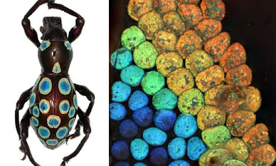
Tropical fish, or defective profile?


I got a call from a printer today who decided to order a custom profile from us.  He's up against a deadline and the canned profile from the paper manufacturer is giving him a lot of banding.

Always curious about bad profiles I asked him to send it to me so I could take a look.  I ran it through some of the tests we do using ColorThink Pro, including Viewing a Rendered Gamut.  (See the "tropical fish" gamut above.)   CTP showed pretty quickly strange handling of blues, and a section of outer gamut magentas were being mapped to color locations well inside the gamut!

It turns out this profile was made using Monaco Profiler, considered one of the best profiling engines of its time, and not too long ago at that.  It occurred to me that even with a good profiling engine, you never really know what you're getting when you build a profile - unless you have a means of checking it out - seeing its shape, if the measurements match the gamut, if it renders appropriately.

This was a publicly distributed profile, going out to users of this well-known brand of paper. My customer said he was using up more paper trying to deal with his "banding" issues than he used adjusting color. To tell the truth, the profile is not so terribly bad that it produces a lot of bad color. In fact, depending on the content of the image a lot of prints might come out fine. But this customer spent a tremendous amount of time and paper trying to solve this problem while running different calibrations and head alignments with Epson. He had a deadline coming up, was supposed to print 40 x 60 inch inkjet prints, and ended up overnighting a new target to us because he was running out of time.

Some people who have never heard of ColorThink (there are a few) ask me why they should get it. How is it going to improve their color tomorrow? And I don't have a good salesman answer for them.  I say something about how it does not fix things so much as it's a diagnostic tool.  That's about when their eyes glaze over and I can imagine what they're thinking - they don't need another diagnostic tool that gives them cool things to look at but has no practical value.   So this real-world example is just one of many, many examples of the practical value of ColorThink Pro. If this customer had CTP, he would have quickly uncovered the cause of the banding that would have saved them more time and money in just one use than the program cost.  When you've got a problem - that's when you need ColorThink.

Monday, October 13, 2014

Black and white display


Maybe this seems rather regressive, but in a day and age when people are using their phones to send text messages, this could be the next Big Thing.

Did you know you can calibrate an Eizo to produce a perfectly black and white display? I didn't. A recent post in ColorForums got me doing some research in this vein.  There are a couple of ways to do this.  One is to create an RGB profile in Photoshop but define the primary colors using very low-chroma primary colors.  Eizo's ColorNavigator software can be called in to emulate that profile on their display and you end up with a mostly black and white display.  An even better way to get a more completely neutral result is to go into the ColorNavigator advanced feature that allows you to independently adjust contrast, saturation and such on 6 colors.   I removed all saturation, re-calibrated, and now have a perfectly calibrated black and white display.   (I wonder if I can get 'I love Lucy' on this...?)

Thursday, March 27, 2014

100 million measurements!

This past November, Maxwell reached a milestone of having received 100 million measurements!

To celebrate this, CHROMiX provided fancy cake for attendees at the 2013 PIA Color Management Conference (in Phoenix, AZ on December 8th). This is the same trade show where we originally announced Maxwell seven years ago.   It was a perfect place and time to mark this great milestone.  It was also some excellent cake.  Lots of people came by, had some cake and took a look at Maxwell.    

As of today, Maxwell is at 114 million measurements and climbing!


Thursday, January 16, 2014

Seattle's 12th man

Seattle fans are quite proud of being the "12th" man on their Seattle Seahawks football team.  As American football goes into its playoff season, the team has home-field advantage for all of its playoff games - and this is quite an advantage as our football stadium is famous for being the loudest in the country.  We are seeing the number 12 with blue and green all over the city - including on our downtown office buildings at night.   This is the Russell Investments Center building in downtown Seattle photographed by David Rosen of SlickPix Photography.


Friday, October 4, 2013

Cadbury loses legal fight over use of colour purple

This is an interesting example of the color trademarking activities we've mentioned in lectures and newsletter articles before.

It appears that both Cadbury and Nestle want to be able to use the color purple for selling candy.

From the color geek point of view it's interesting to note that:

a) the color was specified as Pantone 2865c and
b) Cadbury lost because their "formulation does not comply with the requirements for trademark registration"

Presumably that's color formulation and not chocolate...

Apparently the judge thought that "To allow a registration so lacking in specificity, clarity and precision of visual appearance would offend against the principle of certainty"

I wonder if specifying the color in CIELab would have helped?

We were alerted to the story on the BBC News website but there's a bit more detail on the WSJ website